Light does more than simply illuminate a dark room; it dictates how we perceive the world around us. Have you ever noticed that a navy blue shirt looks black in a dressing room, or that fresh produce looks vibrant in a grocery store but dull in your kitchen? These discrepancies are rarely the fault of your eyes. Instead, they are the result of how a specific light source renders color. Understanding What Is CRI in LED Lighting? is the first step toward creating an environment that looks natural, comfortable, and visually accurate.
The Color Rendering Index (CRI) is a quantitative measure of a light source's ability to reveal the colors of various objects faithfully in comparison with a natural or ideal light source. While it sounds technical, CRI is essentially a "quality" score for light. The higher the score, the better the light source is at showing the true colors of your clothes, food, and skin tones.
The Mechanics of Color Rendering
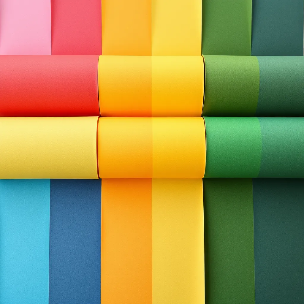
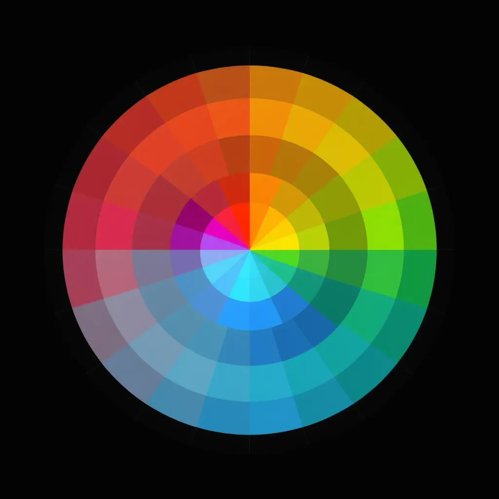
To understand CRI, one must first understand that white light is not a single color. It is a blend of all colors in the visible spectrum-red, orange, yellow, green, blue, indigo, and violet. When light hits an object, the object absorbs some colors and reflects others. The reflected colors are what we see. If the light source hitting a red apple lacks red wavelengths, the apple cannot reflect red, and it will appear muddy or gray.
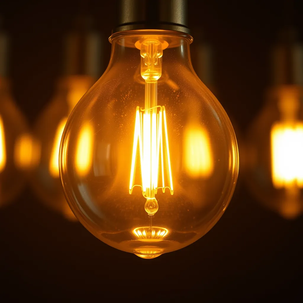
CRI is measured on a scale from 0 to 100. A score of 100 represents "perfect" light, which is defined as natural sunlight or incandescent light. These sources contain a full, continuous spectrum of colors. Most standard LEDs fall between 80 and 90, while specialized high-fidelity LEDs can reach 98. It is important to note that CRI is a relative measurement. It compares a light source to a reference source of the same color temperature. This means a warm 2700K LED is compared to an incandescent bulb, while a cool 5000K LED is compared to natural daylight.
The Standard Test Colors (R1-R8)
The traditional CRI value, often denoted as Ra, is calculated by averaging the scores of eight standard color samples. These samples, labeled R1 through R8, are mostly pastel or desaturated colors. The light source being tested is shone on these samples, and the resulting color is compared to the reference source. If the match is perfect, the score is 100. If there is a significant shift in how the color appears, the score drops.
CRI Range | Visual Quality | Typical Applications |
|---|---|---|
95-100 | Exceptional | Art galleries, jewelry stores, photography, high-end retail |
90-95 | Excellent | Residential kitchens, bathrooms, clothing boutiques, museums |
80-90 | Good | General office spaces, schools, hospitality, hallways |
70-80 | Fair | Warehouses, industrial facilities, parking garages |
Below 70 | Poor | Outdoor area lighting, older street lamps, security lighting |
The Critical Importance of the R9 Value
One of the most significant criticisms of the standard CRI system is its reliance on the R1-R8 pastel samples. These colors do not represent the full range of what we see in the real world. Specifically, the standard Ra calculation ignores saturated colors, the most important of which is R9 (Saturated Red).
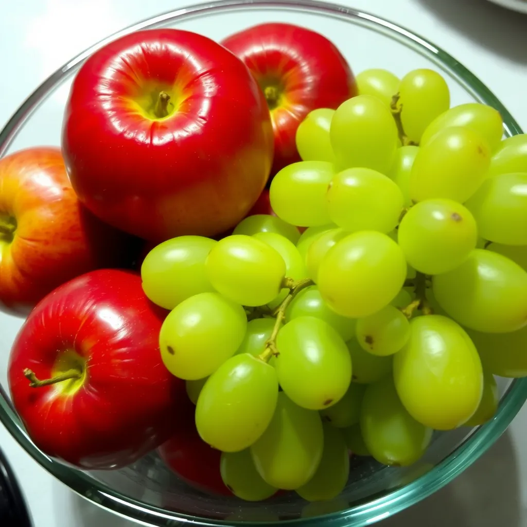
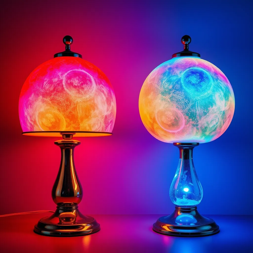
Red is a vital color in human environments. It is the primary component in skin tones, the richness of wood furniture, and the appearance of meats and fruits. Many LEDs with a high Ra (such as 80 or 85) actually have a very low, or even negative, R9 score. This is why some "high-quality" lights can still make people look pale or "greenish."
When selecting lighting for spaces where people are the focus-like bathrooms, dining rooms, or retail stores-looking for the R9 value is just as important as the general CRI. A high-quality LED for residential use should ideally have an R9 value of 50 or higher. For professional photography or medical environments, an R9 of 90+ is often required to ensure that red tones are rendered with absolute precision.
Extended CRI (R1-R15)
To address the limitations of the standard 8-color test, the extended CRI system includes seven additional samples:
R9: Saturated Red
R10: Saturated Yellow
R11: Saturated Green
R12: Saturated Blue
R13: Caucasian Skin Tone
R14: Leaf Green
R15: Asian Skin Tone
A "High CRI" claim on a product box usually refers to the Ra (R1-R8), but savvy buyers look for the "Extended CRI" or "Re" values to ensure the light handles skin tones and vibrant colors correctly.
CRI vs. Color Temperature: Clearing the Confusion
A common mistake is assuming that "cool" light has a higher CRI than "warm" light, or vice versa. In reality, Color Temperature (CCT) and CRI are independent metrics. Color temperature, measured in Kelvin (K), describes the hue of the light itself-whether it looks yellow (2700K), white (4000K), or blue (5000K+).
CRI describes how well those hues reveal the colors of other objects. You can have a "Warm White" 2700K bulb with a CRI of 95 that makes your living room look cozy and your wood floors look rich. You can also have a "Daylight" 5000K bulb with a CRI of 70 that makes everything look sterile and washed out. When designing a space, you must choose the CCT for the mood and the CRI for the visual accuracy.
Light Source Type | Typical CRI | Color Characteristics |
|---|---|---|
Natural Sunlight | 100 | Full spectrum; the gold standard for accuracy. |
Incandescent / Halogen | 100 | Perfect rendering of warm tones; lacks some blue. |
High-End LED | 95-98 | Nearly indistinguishable from natural light. |
Standard LED | 80-85 | Adequate for most tasks; some "muddiness" in reds. |
Fluorescent (T12) | 60-75 | Often produces a green or yellow tint; poor rendering. |
High-Pressure Sodium | 20-30 | Monochromatic orange; nearly impossible to distinguish colors. |
The Practical Impact in Residential Spaces
Why should the average homeowner care about What Is CRI in LED Lighting? The answer lies in how your home feels. Low-CRI lighting creates a "flat" atmosphere. It can make a high-end granite countertop look like cheap plastic or a vibrant painting look like a faded photocopy.
The Kitchen and Dining Area
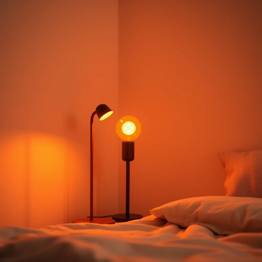
In the kitchen, CRI is a matter of both aesthetics and function. You need to be able to judge the freshness of food. High-CRI lighting (90+) ensures that vegetables look crisp and meats look natural. In the dining room, high color rendering makes meals look more appetizing and enhances the social atmosphere by making guests' skin tones look healthy and warm.
Bathrooms and Vanity Lighting
This is perhaps the most critical area for high CRI. Applying makeup or shaving requires seeing colors exactly as they will appear when you step outside. If your bathroom lights have a low CRI or a poor R9 value, you may over-apply blush or fail to notice a mismatched foundation shade because the light isn't reflecting those red and pink tones back to your eyes.
Living Rooms and Art
If you have invested in decor, rugs, or artwork, low-CRI lighting is doing those items a disservice. A CRI of 90 or above will bring out the textures in fabrics and the depth in oil paintings. It prevents your home from looking "grayed out" during the evening hours.
Technical Trade-offs: Efficiency vs. Accuracy
If high CRI is so much better, why aren't all LEDs rated 100? The reason involves a fundamental trade-off in LED physics. To create white light, most LEDs use a blue light-emitting chip coated with a layer of yellow phosphor. This "Stokes shift" converts blue light into a broader spectrum.
To achieve a higher CRI, manufacturers must add more complex phosphor layers, particularly those that emit red light. These additional layers absorb more energy and are less efficient at converting electricity into visible light (lumens). Consequently, a CRI 95 bulb might produce 10-15% fewer lumens per watt than a CRI 80 bulb of the same wattage. For most users, this slight loss in energy efficiency is a small price to pay for significantly better light quality.
Beyond CRI: The TM-30-15 Standard
As LED technology has matured, the lighting industry has recognized that the 100-point CRI scale is somewhat outdated. It doesn't tell us if a light makes colors look more saturated (which people often prefer) or just accurate. This led to the development of TM-30-15, a more comprehensive method of measuring color quality.
TM-30 uses 99 color samples instead of 8 and provides two distinct scores:
Rf (Fidelity): Similar to CRI, this measures how accurately colors are rendered.
Rg (Gamut): This measures the saturation level. A score of 100 means average saturation, while a score above 100 means colors look more vivid and "pop" more than they do under natural light.
While CRI remains the standard on consumer packaging, architects and lighting designers increasingly use TM-30 to fine-tune the "feel" of a space.
Final Recommendations for Choosing LEDs
When you are shopping for your next set of bulbs or fixtures, do not settle for "white" light without checking the specs. Follow these guidelines to ensure you get the best visual experience:
Check the Box: Look for the CRI (sometimes called Ra) value. If it is not listed, it is likely 80 or lower.
Prioritize 90+: For any room where you spend significant time (living room, bedroom, kitchen), insist on CRI 90+. The cost difference is now negligible.
Ask About R9: If you are buying high-end fixtures for a remodel, ask the manufacturer for the R9 value. Aim for 50 or higher.
Consider the Environment: In a garage or basement workshop where you are just looking for a dropped screw, CRI 80 is perfectly fine. Save the high-fidelity bulbs for the areas that matter.
By paying attention to these details, you can transform a space from feeling "lit" to feeling "alive." Color rendering is the hidden ingredient that separates professional interior design from basic utility lighting.
Conclusion
CRI is the hidden metric that separates ordinary lighting from truly exceptional illumination. While lumens measure brightness and Kelvin defines hue, only CRI reveals whether colors appear natural and vibrant. Prioritize bulbs rated 90 or higher, check the R9 value for accurate reds and skin tones, and match color temperature to each room's purpose. The slight trade-off in efficiency is well worth it - great lighting isn't about quantity, but how faithfully it reveals the world.
Frequently Asked Questions
Q1: Does a higher CRI mean the bulb is brighter?
A: No. Brightness is measured in lumens. CRI measures the quality of the light, not the quantity. In fact, because high-CRI bulbs require more phosphor, they are often slightly less bright than a low-CRI bulb of the same wattage. Always check the lumen count if brightness is your primary concern.
Q2: Can I see the difference between CRI 80 and CRI 90?
A: Most people can notice a difference when the two are placed side-by-side. Under CRI 80, colors look slightly flatter or more "washed out." Under CRI 90, colors appear more distinct and vibrant. The difference is most obvious in skin tones and natural wood finishes.
Q3: Is CRI the same as "Full Spectrum" lighting?
A: The term "full spectrum" is often used as a marketing buzzword and does not have a strict technical definition. However, a "full spectrum" bulb generally implies a high CRI (usually 95+) and a color temperature that mimics daylight (5000K-6500K). While they are related, CRI is the actual scientific metric you should look for on the spec sheet.